

Carita Brand & Marketing
Branding, Direction, Marketing

carita | branding & marketing
Carita: A Brand Built On Caring for Causes
Project overview
I was excited to work with Carita, the world's first fundraising and dating app — directing and developing their brand’s look, feel, and voice. The platform allows users to fundraise for onboarded nonprofit partners, while donating to other user's causes that they are passionate about, in the hopes of connecting individuals with similar interests.
SERVICES PROVIDED: Direction, BRANDING, Marketing

CHALLENGES
The dating app market is oversaturated and a tough space to enter. The brand would need to distinctly stand out among the clutter.
A concept marrying fundraising and dating may appear foreign to many potential daters.
SOLUTIONS
Providing Carita with a uniquely warm tone in brand voice and color was quintessential to highlight the platform as a dating app that cares about causes and to appeal to the target audience.
Focusing on the simple idea of swiping for something you believe in and sparking connections built the bridge between fundraising and dating. Warm colors, strong typography, and resonant imagery highlighted compassionate stories.


Logotype and brandmark
The Carita logo was designed to symbolize community. The coming together of different individuals towards a coming goal, helping each other along the way and fostering a connection. Corporate colors were chosen for sleek tone, with an accent of warmth, representing a dating app at the cutting edge of innovation.

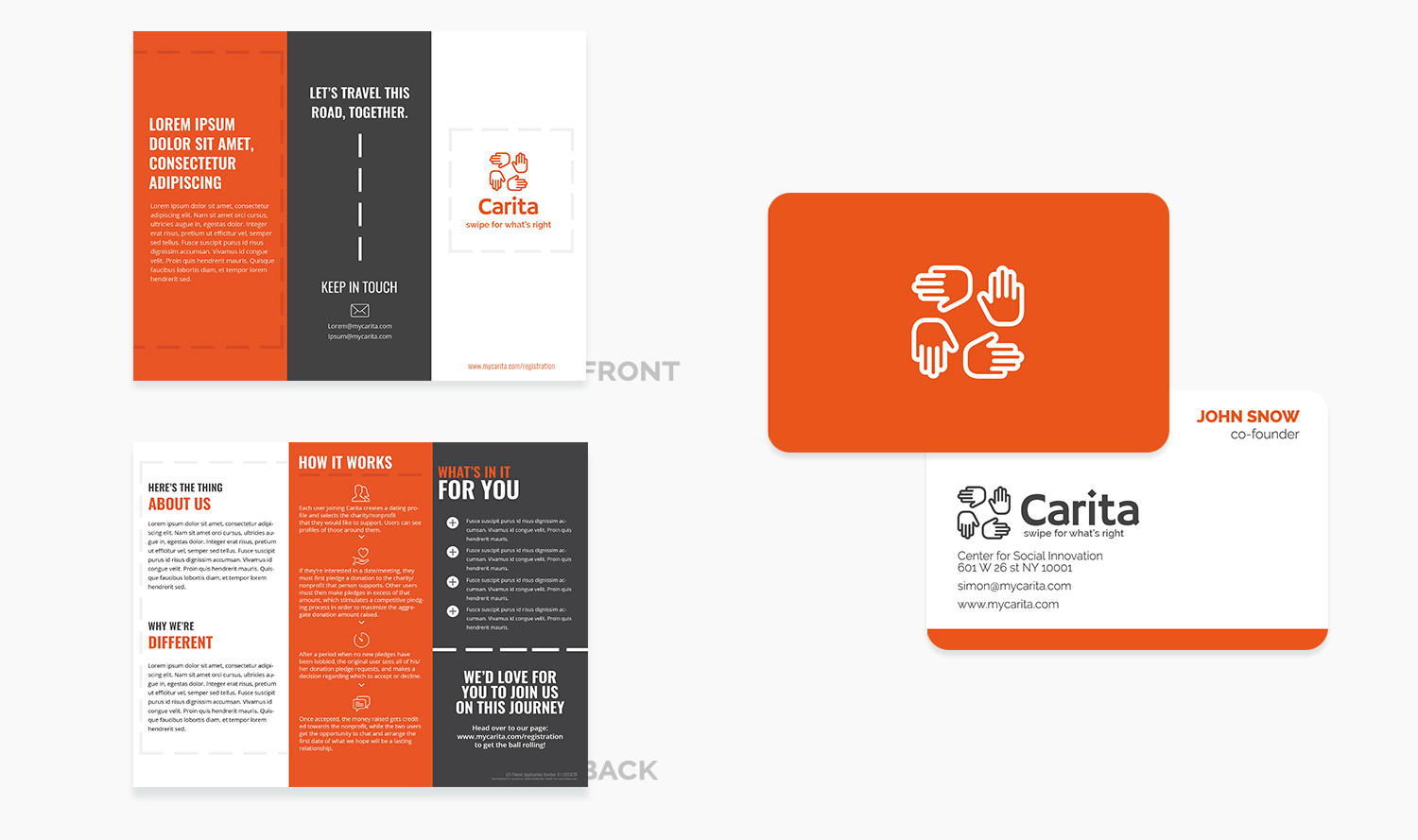

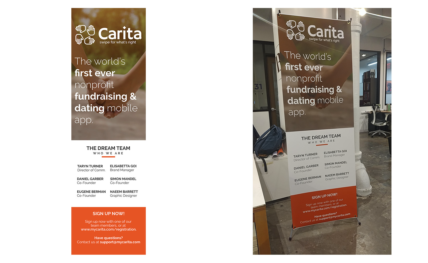
Various corporate marketing collateral
Numerous corporate assets were created to help illustrate the concept of the brand to potential partners and investors, as well as early-stage users who would be interested in signing up.


Visual Look and Feel
Imagery was selected for its feeling of warmth, palette application, and level of appeal to Millennial stories, creating a strong resonance within the target audience.

Outside Inspiration
Inspiration taken from modern typographic heavy ads, focusing on color blocking, storytelling, and space.


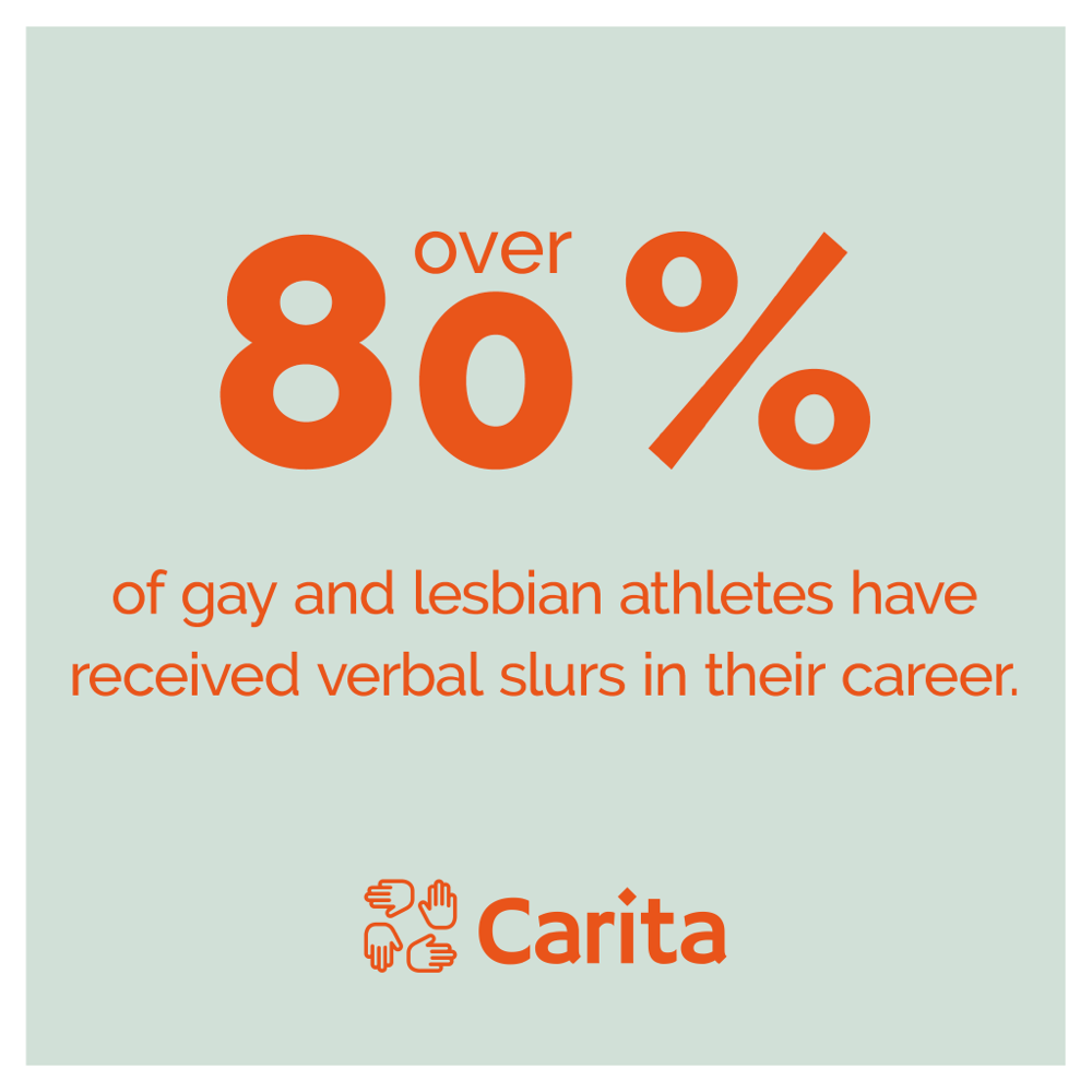
Composite advertisements
Advertisements were to focus on simple stories, sparking connection-based conversations around causes such as volunteering, nonprofit work, and sharing passions with loved ones. Typography remained simple with ample room to breath, creating a space for the resonant and imaginative story to develop for the viewer.
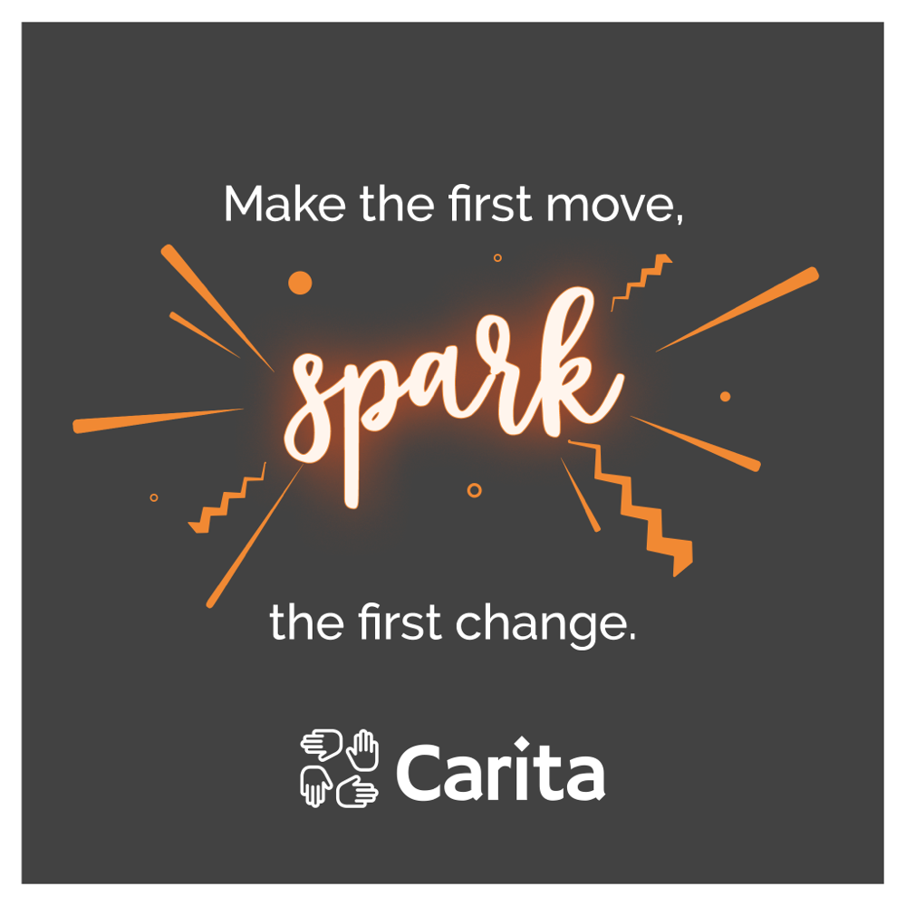


Social Posts
Similar to the advertisements, social posts focused on stories of warmth, compassion, innovation, sustainability, and potential relationships formed from a deeper connection. This created synergy between ads and social media, cementing the tone of the brand to viewers.


